How to Create a Heat Map with Color Background
RIPL 7 introduced the ability to generate a scatter chart with a yellow-to-red background. This type of chart is also called a heat map, where x,y values are considered more severe as the points are plotted up and to the right. Typically, a heat map is used to plot Likelihood of Failure on one axis and Consequence of Failure on the other axis, rendering a visual that quickly identifies segments with the highest overall risk.
-
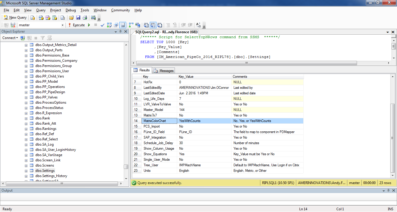
To enable a yellow-to-red color gradient for a RIPL scatter chart, have your database administrator set the MatrixColorChart parameter in the dbo Settings table of your RIPL database to either Yes or YesWithCounts.
-
In RIPL, select the components you want to be included in your chart in the component hierarchy frame. Make sure click the blue check icon
 .
. -
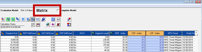
Select the risk evaluation for the Risk of Failure (often called ROF in many RIPL databases) to display the analyzed data grid. Ensure that the model state is green
 , which means the analysis has run with the most up to date information and configurations within RIPL.
 -
Within the grid, left-click the top of the COF column; then shift+left click the LOF column.
-
Click Matrix.
-
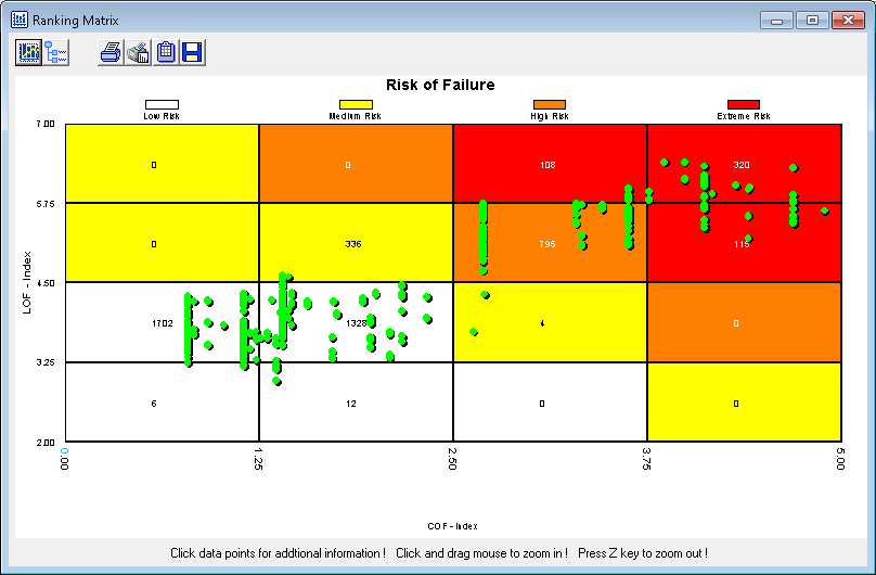
The matrix chart will display, as well as a heat map, similar to the one shown. If not, try right-clicking the chart and changing both the X-Axis and Y-Axis to four divisions. The yellow-to-red background only works on a 4x4 matrix.
-
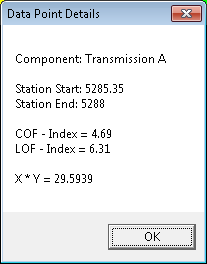
Each point on the heat map represents a dynamic segment within the Risk of Failure evaluation. The more a datapoint is to the right and the higher up on the chart it is placed equals more risk. Click on a datapoint to display a dialog box with details for LOF, COF, ROF score as well as the component the segment is on and its linear referenced location.