Edit Form Object Properties
Once a form object, including the controls and fields listed in the Controls and Fields pane, is added to the form, its properties can be set in the associated Properties pane. These properties can include options to change the text content and style, the border and fill of the object and/or the text field, the source of a grid or image, and the tab details. Depending on the control, some properties may not be available.
To edit a form object's properties after it has been added to the workspace, select the form object and use the Properties pane to modify the available properties.
Label properties determine the text that should appear in the form object, the horizontal alignment, background color, border color and thickness, and font properties.
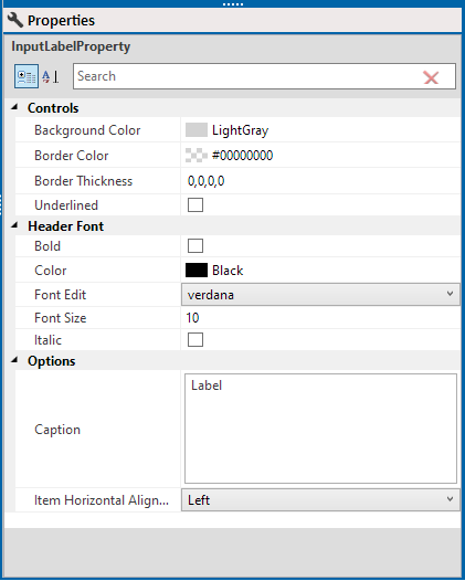
Label Control Properties
-
Controls — select background color, border color, border thickness, and whether or not the label text is underlined.
-
Header Font — select from the various font options.
-
Options — enter the label name in the Captiontext field. You can also select how the label will display within the field from the Item Horizontal Align drop-down list.
Tab properties allow you to add, remove, and rename tabs in a tab control, as well as change the overall look of the tabs.
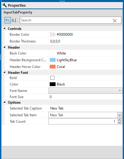
Tab Control Properties
-
Controls — select border color and thickness.
-
Header Font — select background color, header background color, and header hover color (the color the object will be when a mouse hovers over it).
-
Header Font — select to bold the header, select the font color, font type and size.
-
Options — to select a tab for editing, select the name from the Selected Tab Item drop-down or click the tab's name to select the tab and rename it Selected Tab Caption field. Select the number of tabs in the tab control, enter the desired number of tabs in the Tab Count field or click the up and down arrows to increment the count. The tab control adds or removes tabs as necessary to match the number of tabs in the Tab Count field.
Picture properties modify the display of an image in the picture control. Images smaller than 10MB can be loaded into the image control. For optimal performance, however, images larger than 200KB should not be used.
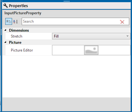
Picture Control Properties
-
Dimensions — select how the image will fill the space from the Stretch drop-down list. Options include:
-
None: The image is not re-sized within the control.
-
Fill: The image is re-sized to fill the control.
-
Uniform: The image is re-sized to fit within the control's edges while maintaining its original aspect ratio.
-
UniformToFill: The image is re-sized to fill the control while maintaining its original aspect ratio. If necessary, the image is clipped to fit within the control's edges.
-
-
Picture — fill the control with an image by hovering your mouse over the picture placeholder in the Picture Editor field. The source menu displays.
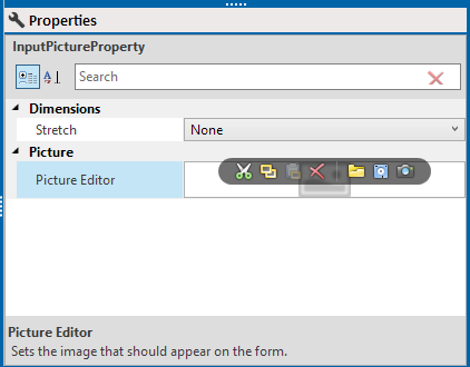
Source Menu
-
To load an image file into the picture control, click
 and navigate to the desired image file. Click to select the image file and click OK.
 -
To paste a copied image into the picture control, click
 . The contents of the clipboard are pasted into the picture control.
 -
To clear the image from the picture control, click
 . The current image is removed from the picture control.
 -
To copy the image for use in other picture controls or to paste in other applications, click
 . The image is copied to the clipboard.
 -
To copy the image and clear it from the picture control, click
 . The image is copied to the clipboard and cleared from the control.
 -
To save the image to file, click
 and navigate to the desired save location. Enter a name for the image file in the field provided, select a file type from the drop-down, and click Save. The picture is saved as an image file.
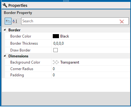
Border properties alter the look of the entire form object's border and background.
Border Control Properties
-
Border — select border color and thickness. Select the Draw Border check box to add a border.
-
Dimensions — select background color. Select how round a border's corner is in the Corner Radius field. To create a more rounded corner, enter a higher value in the field. To create a square corner, enter 0 in the field. To control the amount of space between the form object's contents and the border, enter a value in the Padding field.
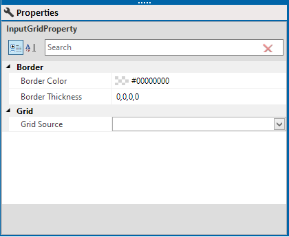
Grid properties dictate the display of the mini-grid data.
Grid Control Properties
-
Border — select border color and thickness.
-
Grid — select a mini-grid from the Grid Source drop-down list to determine which mini-grid data appears in the control.
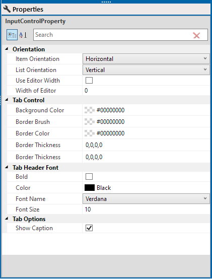
Text Field properties — modify the look of the input text field or text box.
Field Properties
-
Orientation — select Item Orientation and List Orientation from the drop-down list fields. To resize the text field a specific size independent of the size of the form object, select the Use Editor Width check box. The text field will size to the width specified in the Width of Editor property and align to the right side of the form object. To set the width of the text field, enter a value in the Width of Editor field or use the up and down arrows to increment the value. The Use Editor Width property must be enabled for the width to change.
-
Tab Control — select colors for the background, border brush, and border. For the Border Thickness:
-
To set a simple border of uniform thickness around the entire text field, enter a single number.
-
To set a border whose thickness on the top and bottom are the same and the left and right are the same, enter the left/right thickness followed by a comma and the top/right thickness.
-
To set a border whose thickness varies on each side of the text field, enter each border's thickness followed by a comma in the following order: right, top, left, bottom.
-
Tab Header Font — select options for the font weight, color, family, and size.
-
Tab Option — select Show Caption to show the caption for the field.