Add Controls to the Form Theme
The same data fields and mini-grids that can be shown in a data entry grid can be added to a form theme. In addition, labels, images, and borders can be added to improve the design of the form theme. Labels can also be used to provide additional information or instruction within the form.
Tab controls allow objects on the form to be organized within tabs. Data fields, mini-grids, labels, images, borders, and even other form items can be grouped under an individual tab within a tab control. Form items can only be added to a tab from the Controls and Fields pane, which included separate panes for Controls and Fields.

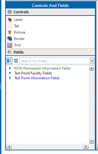
Controls and Fields Pane
Items added to the form are called controls and are found within this pane.
You add items to the form in the staging area between the Controls and Fields pane and the Alignment and Properties pane.
The following items can be added to the form:
-
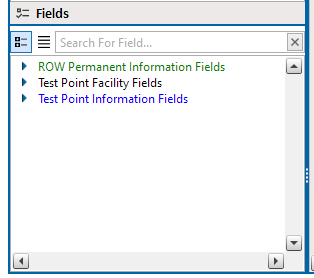
Data Entry Fields. To add a data entry field to the form theme, find the desired field in the Fields pane.

Fields Pane
Click to select the field and drag it to the form theme staging area. A data entry field is added to the form theme. The colors, border and fill, font, caption visibility, width, and alignment of the field can be edited in the Properties pane.
-
Images Fields. To add an images field, such as Facility Information Images, find the desired field in the Fields pane. Click to select the field and drag it to the form theme. An images field is added to the form theme. The colors, borders, font, and caption visibility of the field can be edited in the Properties pane
-
Mini-Grid Controls. To add a mini-grid to the form theme, click to select the Grid control and drag it to the form theme. A mini-grid is added to the form theme. Select the mini-grid from the Grid Source drop-down in the Properties pane. The mini-grid's border can also be edited in the Properties pane.
-
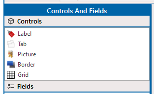
Label, Picture, and Border Controls. To add a text label, picture, or border to the form theme, click to select the desired control and drag it to the form theme.

Controls Pane
Depending on the control added, various properties can be edited in the Properties pane. A label's color, border, alignment, caption text, and font style can be edited; a picture's source file can be identified and its size determined; and a border control's color, padding, and border can be set.
-
Tab Controls. Tab controls allow form objects to be grouped into one or many tabs, as well as allowing more objects to be added to the form theme without increasing the form's size. One tab control can have multiple tabs, each of which contain fields, grids, and other controls. To add a tab control to the form theme, click to select the Tab control and drag it to the form theme. The tab control is added, consisting of a single tab. Once added to the form theme, edit the tab control in the Properties pane to add more tabs, change the tab names, or alter the look of the tabs.
Fields and other controls can only be added to a tab directly from the Controls and Fields panes. Once in a tab, a field or control cannot be moved outside of its current tab.
Form objects are added to the control unlocked and ready for editing, resizing, and rearranging.